- After moving to the Bay Area, we wanted to understand whether the patterns people often talk about were showing up in the data. So we loaded Petavue with publicly available government datasets and started digging in.
- The pattern across San Francisco becomes clear once the data is stitched together: violent crime, nuisance activity, 311 demand, and administrative burden are not scattered problems; they concentrate in the same pockets of the city.
- These indicators don’t just align; they rise and fall almost in lockstep. The coupling across public-safety risk, disorder signals, and neighborhood-level stress points to a shared underlying condition, not a collection of unrelated issues.
- Administrative load emerges as one of the strongest early markers. Long before severe incidents spike, you can see districts accumulating strain through service requests, complaints, and operational workload.
- Response-oriented services cluster around the highest-risk zones, while preventive and stabilizing services remain thin precisely where they’re most needed, a structural imbalance that keeps the same districts cycling through crisis.
- The goal of the research and this article isn’t to argue for a policy outcome. It’s an attempt to read the system cleanly: when you strip out anecdotes and sentiment and look at how the signals behave together, the city’s dynamics become easier to understand and harder to ignore.
San Francisco’s challenges aren’t exactly hidden. Anyone who follows local news or city data knows that some neighborhoods carry far more pressure than others.
After moving to the Bay Area, that awareness became sharper. Not because of social media narratives or viral videos, but because cities signal stress in quieter ways: cracked sidewalks, shuttered storefronts, visible distress, and the overall feel of a street over time.
That raised a practical question.
When people say certain neighborhoods feel less stable, is that just personal perception? Or are those instincts tracking something real in the data?
Instead of guessing, we treated this as an analysis problem.
How we approached it
- We pulled publicly available datasets published by the city
- This included crime data, 311 requests, and administrative service signals
- We analyzed everything together using Petavue
- The goal wasn’t to prove a narrative, but to test one responsibly
We examined a widely discussed issue rather than rely on anecdotes.
What the data showed
San Francisco is often described as dealing with separate problems:
- Crime in some areas
- Homelessness in others
- Overloaded city services everywhere
But the data tells a more connected story. Here's what we found.
Districts where the Issues Converge
Some neighborhoods don’t just feel more strained, the data shows they carry most of the city’s challenges at once. These areas, which we can think of as Convergence Zones, are where crime, disorder, and service demand all rise together.
Here is how San Francisco is divided into supervisor districts:
A few districts consistently rank highest in violent crime. But what makes them stand out isn’t just the crime rate, it’s the mix of conditions surrounding it. These same districts experience the most visible disorder, the highest number of 311 requests, and the heaviest administrative load.
The gaps between districts are large:
- Violent crime ranges from 2.8% to 22.2%, an eightfold difference.
- Nuisance behavior rises 4.5x between the lowest and highest districts.
- Police interaction is nearly 10x higher in the most strained areas.
- 311 requests vary sharply, from 4x to 18x depending on the category.
- Cleanliness complaints in these districts have over 10 complaints per capita, showing how much ongoing cleanup they require.
The Near-Perfect Correlation of Public Safety and Crime
We wanted to dig deeper into the relationship between public safety nuisances and crime severity. When we looked at the data we found the crime categories to be a long list, so we bucketed them by severity, to the best of our judgement.
Here’s how we have grouped the crime categories into simpler buckets for understanding:
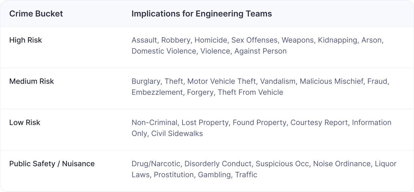
The most striking statistical finding is the relationship between High-Risk Crime and Public Safety Nuisances. The correlation coefficient between these two metrics is 0.99.
This is not merely a strong relationship; it is virtually a mirror image. Where violent crime goes up, nuisance behavior, loud disputes, drug use, suspicious activity rises almost perfectly in sync, and vice-versa. We need to be mindful that this shows correlation, not causation. But the correlation is astonishingly close, nearly perfect.

This convergence of severe violence and pervasive disorder places an unsustainable burden on these communities and the city services designed to support them. They are neighborhoods where city systems are working overtime just to keep up, facing constant system strain in an environment where everything is happening at once.
Digging Deeper and Finding Patterns
San Francisco’s data makes a simple point clear: the everyday signs of disorder people notice on the street aren’t trivial, un-aesthetic, or harmless. They’re closely tied to where the city sees its most serious crime.
Even the correlations with core elements of visible disorder and high-risk crime are extremely strong:
- High-risk crime and Noise have a correlation of 0.87.
- High-risk crime and Cleanliness have a correlation of 0.85.
- High-risk crime and Encampments have a correlation of 0.79.
Crime and disorder are tightly coupled. They show that when a neighborhood struggles with visible disorder, it’s usually dealing with deeper pressures at the same time. Crime doesn’t emerge in isolation, it grows out of environments where strain is already visible and accumulating.
The struggling neighborhood upkeep might not be the cause of crimes. But it correlates very closely.
The Sleeper Indicator: Administrative Strain
Next, we wanted to understand whether there’s a relationship between day-to-day operational stress in a neighborhood and the crime reported there.
To test this, we looked at 311 data as a proxy for administrative load. We defined a metric, formalized it, and saved it inside Petavue so it could be reused and validated.
Administrative General Services (AGS) Rate measures how often residents ask the city for non-emergency help through channels like 311.
When we compared this against crime data, a clear pattern emerged.
Districts with the highest AGS Rates—ranging from 31.28% to 76.26%—also show sharp increases across all major crime categories. That overlap makes AGS a strong early indicator of neighborhoods where service demand and public safety stress rise together.
Here are the graphs I could plot for quicker visualization.
- Correlation: High-risk crime and Administrative General Services (AGS) Rate

- Correlation: Medium-risk crime and Administrative General Services (AGS) Rate

- Correlation: Public nuisance and Administrative General Services (AGS) Rate

The correlation indicates that Administrative Strain is a sign that a neighborhood is leaning heavily on basic city systems because underlying issues aren’t being resolved.
But understanding correlation isn’t enough. To grasp why strain persists, we have to look at what support systems exist, and what’s missing.
The Paradox: More Crisis Response, Less Crisis Prevention
The most counter-intuitive finding in San Francisco's data involves the city's deployed resources. When looking at emergency facilities namely, Police Department and Fire Department stations, the city has an appropriate placement strategy. Emergency teams are stationed where incidents occur most frequently.
- Police Presence: High-Risk Crime Districts house 38.1% of all Police Department facilities (8 out of 21).
- Fire Presence: These districts also contain 28.1% of all Fire Department facilities (16 out of 57).


At first glance, this seems reassuring. The areas experiencing the most harm also have the strongest emergency presence. But this is where the insight becomes counterintuitive: even though these districts have more police and fire coverage, they still face the highest levels of disorder and violence.
This creates a structural imbalance: the city concentrates responders where harm occurs, yet the upstream agencies that could reduce harm are largely missing.
Why Prevention Matters
Preventive agencies shape the conditions that stabilize neighborhoods:
- Human Services and Homelessness Support reduce encampments and cycles of vulnerability.
- Public Health intervenes early in behavioral crises that might otherwise emerge as disorder.
- Public Works and the Public Utilities Commission (PUC) influence day-to-day cues through lighting, sanitation, and infrastructure.
These systems form the long-term safety net that allows neighborhoods to stay stable—not just respond to emergencies.
Yet the districts with the highest crime rates lack many of these foundational services.
Where the Gaps Are Most Severe
- Human Services Agency (HSA): No facilities currently operate in high-risk districts, leaving a 100% service gap.
- Public Utilities Commission (PUC): Population needs indicate about 21.3 facilities, but only 5 are in place.
- Homelessness & Supportive Housing: Capacity is also far below district need.
- Other agencies with notable deficits include Public Health, Public Works, and the Municipal Transportation Agency (MTA).
The Impact on Access
The chart below highlights how preventive infrastructure is overwhelmingly concentrated in lower-risk districts. For several agencies, high-risk districts hold only a small fraction of available facilities.
.jpeg)

Acknowledging these gaps makes it obvious that the current system wasn’t designed for the complexity it faces. The path forward requires more than response, it requires alignment.
Conclusion: As per Gemini 3 and ChatGPT 5.1
We uploaded our research into both the cutting edge LLMs and asked them to weigh in. We asked the exact same question to both – “As an expert on urban planning and policy, weigh in with your closing arguments on this analysis.”
Here's what Gemini 3 pro had to say:
San Francisco’s data reveals a critical structural flaw: the city has efficiently deployed its reactive forces to high-crime areas while leaving them devoid of preventive support. These "Convergence Zones" are overwhelmed not just by crime, but by a total collapse of administrative and social infrastructure, creating an environment where emergency responders are managing issues caused by the complete absence of agencies like Human Services. The path forward is clear: the city must stop treating these districts solely as crime scenes and start stabilizing them by physically embedding the missing preventive services directly where the strain is highest.
Here's how ChatGPT 5.2 responded:
San Francisco’s data points to a simple truth: the neighborhoods carrying the city’s heaviest mix of crime, disorder, and service demand are also the ones with the weakest access to preventive systems, leaving responders to shoulder problems that upstream agencies were never positioned to solve. The patterns in this analysis make the path forward clear—treat these convergence zones as places where the city must rebuild its foundation, not just reinforce its perimeter. Only when long-term supports stand alongside emergency teams will these districts have a real chance to move from strain to stability.
What do we have to say:
We aren’t policy experts and do not want to pretend like it as well. Our sole attempt was to answer our own curiosity and see a picture that perceptions might hide and analysis might reveal. Petavue is a truth-first analysis platform. Petavue is a truth-first culture.